-
How this LA Unified math teacher and blogger hooked his kids on data

*UPDATED There were three days left in the school year, and final grades had already been turned in. Benjamin Feinberg’s 8th grade algebra students at Luther Burbank Middle School in Highland Park were looking forward to graduation and officially becoming high schoolers. But despite these kids having no tangible reason to stay engaged in the lesson...
By Craig Clough | July 12, 2016
-
State Education Data Made Easy

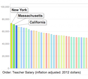
A neat interactive mapping widget called “States in Motion” has just been posted on EdSource. The map visualizes data like teacher salaries, student to teacher ratios, growth in enrollments and scores and compares it to other states. It’s the creation of Jeff Camp, who works with a nonprofit volunteer organization called Full Circle Fund.
By LA School Report | September 27, 2013
-
The Eighth-Month Difference
A new analysis released by the Strategic Data Project shows that students taught by the highest-performing math teachers in LAUSD come out eight months ahead of some of their peers. To read the full report, click here. via EdWeek
By Samantha Oltman | November 16, 2012